Show:
Graduation project
Noa van den Boogaard0971346
WdKa
Graphic Design
Honours practice
Sep 2023 - jan 2024


A project about how the everyday (typo-)graphics we encounter on the city streets relate to place- and meaning-making.
The final outcome of this inquiry is a box with tools that help you unravel what the city’s graphic languages are communicating, and to help you develop your own visual voice.

Project timeline
Project plan
20.09.2023

Quotes
Relevant outtakes
Relevant outtakes
“This thesis adds to the academic fields of graphic design theory, visual culture, urbanism by explores the intersection of typographic design, meaning- and place-making in the context of the city of Rotterdam. It aims to find an answer to the question: how do Rotterdam-based makers design meaning with typo-graphics visible in the city streets of Rotterdam?
“ (p. 2)
“(...) get to a nuanced understanding of how meaning is decoded, encoded, and produced in graphic designs we encounter on a daily basis, this research aims to study the systems of knowledge behind the produced objects. It therefore contributes to the research on typographic landscaping (...)” (p. 4)
“investigate the “bigger picture” and create awareness of the (in)visible intentions of designs that exist all around us. It intends to further scholarship about the link between typo-graphic design, semiotic landscapes, ideological and embodied graphic practices and making meaning by focusing on the side of the producers of said meaning. As design has become both aproduct and a process (Balamir, 2021), solely studying the products of design as static texts proves insufficient. (...) I go back to the drawing board, where the decisions on how to wrap up linguistic messages with typography are made.“ (p. 4, 5)
“discussing how the material world of typographic words and signs gains meaning and value in the context of social practice (...) to engage the graphic design(er) with the larger social world, outside their own self-referential history (Banham, 2019, p. 26). As McLuhan once proclaimed: we shape our tools and thereafter our tools shape us (Culkin, 1967, p. 70).” (p. 6, 7)
Themes
Vernacular (typo-)graphic design
meaning-making
place-making
urbanism
world-building
graphic ideologies
visual inflation
Code scheme:
![]()
meaning-making
place-making
urbanism
world-building
graphic ideologies
visual inflation
Code scheme:

Partners
Rotterdam-based designers, academics:
Wouter, graffiti artist
Pieter Vos, graphic designer at 75B
Arno Wolterman, Creative director at IN10
Pauline Wiersema, Social artist/designer
Petre Mogoș, Teacher at Erasmus school of History, Culture and Communication
Wouter, graffiti artist
Pieter Vos, graphic designer at 75B
Arno Wolterman, Creative director at IN10
Pauline Wiersema, Social artist/designer
Petre Mogoș, Teacher at Erasmus school of History, Culture and Communication
Roles:
Interviewed about personal practice
Interviewed about personal practice
Interviewed about personal practice
Interviewed about personal practice
Theorethical and creative consult, thesis supervision
Interviewed about personal practice
Interviewed about personal practice
Interviewed about personal practice
Interviewed about personal practice
Theorethical and creative consult, thesis supervision
Conclusion
Different frameworks through which you can approach the vernacular. Creating an understanding of how the city is written and how graphic design is used as a tool in designing meaning and building the public, physical world.
Make into a publication in which I explain the theorethical findings and a connection to the physical, practice-based research.
How is my knowledge from my thesis applied in the final product?


Practice project
Design question
How can I use/research themes from my thesis, like vernacular (typo-)graphic design, meaning-making, place-making, world-building, in order to create a visual outcome?
How to turn research into action?
How to turn research into action?
Emerging theme/topic
Vernacular (typo-)graphic design
meaning-making
place-making
world-building
Urbanism (with the contect of Rotterdam in specific)
Democratization of graphic design
meaning-making
place-making
world-building
Urbanism (with the contect of Rotterdam in specific)
Democratization of graphic design
What
Approach the subject as a designer; do what as a researcher I couldn’t do. Create a visualisation of the topic and themes so that a new kind of knowledge arises. Not just the linear theory -> visualisation path, but what can I add as a designer?
Why
Urgency/relevance
For myself: In this way, I can show with a final project what I mean with being a Researcher <--> Designer; approaching the subject in two different ways.
Social & academic relevance: graphic design is increasingly present in our online and physical environment. As the outcome of my thesis showed: more research is needed about their possible power in meaning- and place-making.
Social & academic relevance: graphic design is increasingly present in our online and physical environment. As the outcome of my thesis showed: more research is needed about their possible power in meaning- and place-making.
How
Methods
Methods
Through experimentation and interventions in the city.
Possible External partners / inspiration
https://www.archivalconsciousness.org/
https://biblio-graph.org/public/
https://www.instagram.com/erik.kessels/
https://verhalenhuisrotterdam.nl/meewerken-in-verhalenhuis-belvedere/
https://www.schoolforthecity.nl/
https://biblio-graph.org/public/
https://www.instagram.com/erik.kessels/
https://verhalenhuisrotterdam.nl/meewerken-in-verhalenhuis-belvedere/
https://www.schoolforthecity.nl/
3.10.2023
Mapping excercise with Maaike
What drives/motivates you to do what you do? (for example a frustration, problem, vision, hope, etc.)
What do you hope to achieve with your work, or as a person in the world?
Write a short positioning statement: As a …. I believe … I see … I am … I can … I want …
Approach
What does your process of working or producing knowledge normally look like?
Which kinds of knowledges are included/drawn upon?
Which kinds of methods are applied?
Which tools or instruments are used?
What are common outcomes/end products?
What publics are addressed, and how?
What are other skills or interests that did not find their way into your professional practice (yet).
Network/relationality
How does your work relate to that of others?
What/who (human/non-human) offers you knowledge and/or inspiration?
Which networks or collaborations are you part of, within and beyond work/professional practice?
Interest in the amateur vs the proffesional; text in the city; the public/collective archive; the power of visual communication; democratization of graphic design.
A researcher <--> designer
With this final project I want to show what I mean with this: translating my EUR thesis to a visual project for WdKa
Now that for the first time I don’t have any EUR work to focus on, I want to embrace the design process and do a lot of experiments for myself. I have not created a workshop before, or created interventions in the city: I want to be more bold and daring.


Guy debord - Derive


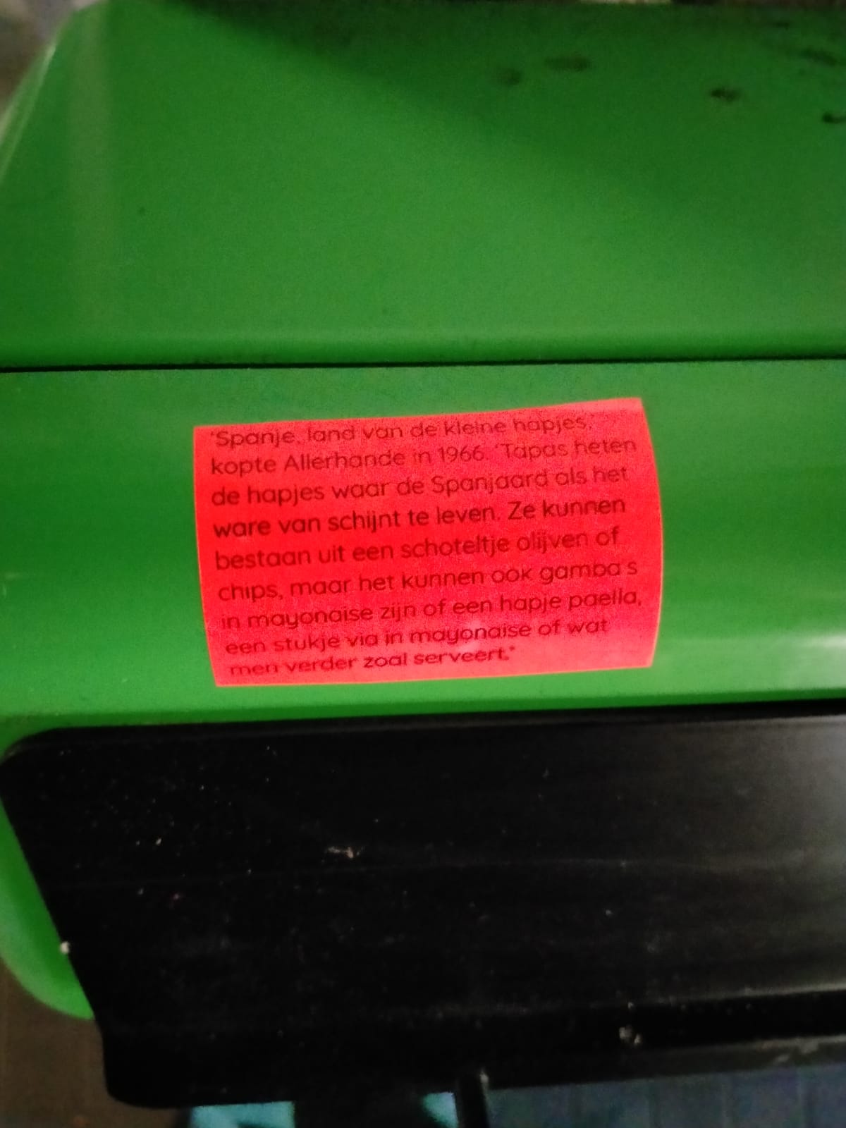
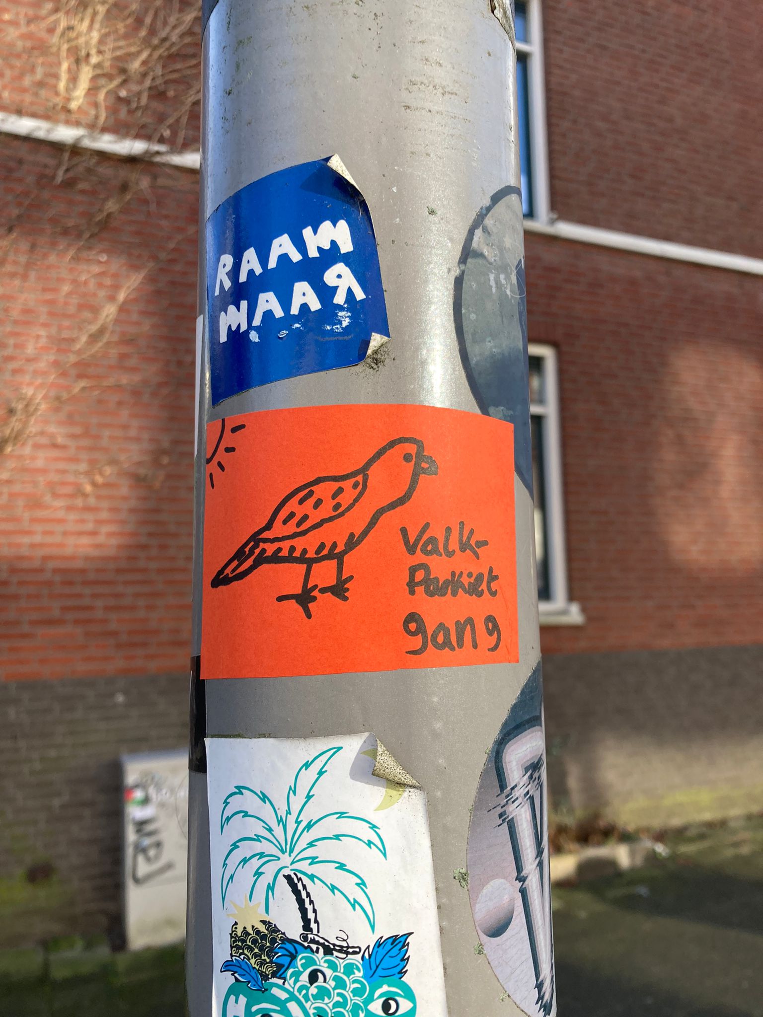
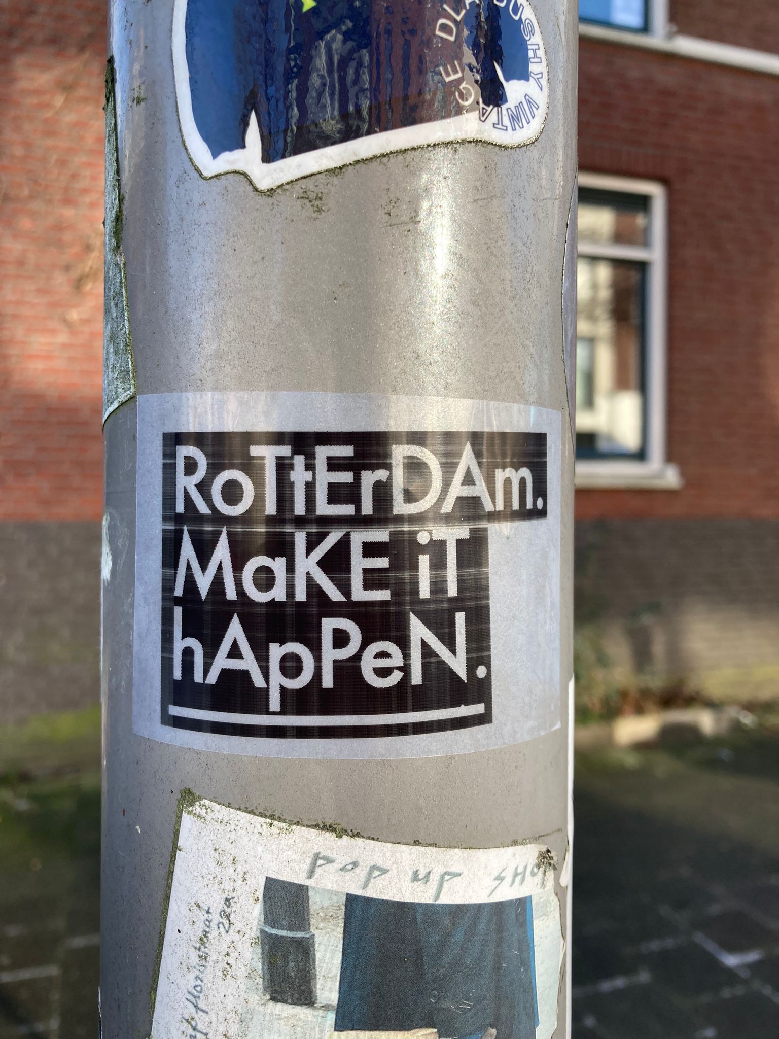
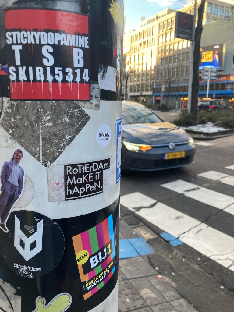
Field research: collecting pictures of (typo-)graphics on the streets of Rotterdam.
In total I collected 1.000+ images, this is a selection:


- Mike Emmerik, director of the independent School For the City. Theorethical and creative consult.
-
Loes van Esch, graphic designer at Team Thursday. Creative consult through a collective workshop at the School For the City.
-
Lisa Heinis, curator of education at Boijmans Van Beuningen. Theorethical consult.
- Marjolein van Braam Morris, StiftShift. Consult on setting up a workshop.
6.10.2023
Meeting with Mike from the school for the city
Meeting with Mike from the school for the city
Gain knowledge about the interdisciplinary approach from the studio. How and why do they do what they do? And brainstorm about my graduation project: what form(s) could it take?
How does the studio research projects research various topics?
How to combine theory with practice?
How do you combine different practices and fields?
How to set up a workshop?
For whom are your workshops; who spreads and who gains the knowledge?
What do you do with this acquired knowledge?
How does redesigning and rethinking work together?
“You’re talking to different people when you are either writing a report or academic paper, or creating a visualisation or artwork from the same theory/topic. One is not better or bigger than the other; it’s just different outcomes, different ways of talking. You have to see how they play togehter and enhance the other”
Show how graphic design influences the way we live in, move through and make sense of the city-scape (of Rotterdam)
Through thesis: focussed on production side of meaning
Now: researching the same topics, but with a design-approach
While talking, we realized that my interests is actually about the tension between the formal and the informal visual languages that are being used in the city streets.
To further investigate this tension, I want to do experiment with graphic interventions that play with the aesthetics of the formal and informal.
Based on these experiments, I want to design a workshop that gives people a visual voice to add to the typographic landscaping, possibly in a similar manner as what I did in my interventions.
Idea for the graduation show: some kind of souvenir/postcard shop with results from the workshops? And/or a place where people could do a mini-version of the workshop?![]()
How does the studio research projects research various topics?
How to combine theory with practice?
How do you combine different practices and fields?
How to set up a workshop?
For whom are your workshops; who spreads and who gains the knowledge?
What do you do with this acquired knowledge?
How does redesigning and rethinking work together?
“You’re talking to different people when you are either writing a report or academic paper, or creating a visualisation or artwork from the same theory/topic. One is not better or bigger than the other; it’s just different outcomes, different ways of talking. You have to see how they play togehter and enhance the other”
Show how graphic design influences the way we live in, move through and make sense of the city-scape (of Rotterdam)
Through thesis: focussed on production side of meaning
Now: researching the same topics, but with a design-approach
While talking, we realized that my interests is actually about the tension between the formal and the informal visual languages that are being used in the city streets.
To further investigate this tension, I want to do experiment with graphic interventions that play with the aesthetics of the formal and informal.
Based on these experiments, I want to design a workshop that gives people a visual voice to add to the typographic landscaping, possibly in a similar manner as what I did in my interventions.
Idea for the graduation show: some kind of souvenir/postcard shop with results from the workshops? And/or a place where people could do a mini-version of the workshop?

First draft of the (possible) final project:
1.
Graphic interventions
2.
Publication - Writing the City
As research project: for teachers/assesors to understand theorethical background
As research project: for teachers/assesors to understand theorethical background
3.
Workshop
What can I give during the workshop?
Visual voirce; awareness of power relations through design
What can I learn from the workshop?
How others make sense of the (typo)graphic city landscape
For whom is it?
4.
Installation for the final graduation show
Can be finalized later in the academic year?
Can be finalized later in the academic year?
Rough planning Outline
Giving myself time for creative experiments, without thinking (too much) about the end product and the theory.
Week 42, 43, 44
12.10.2023 - 2.11.2023
Experimenting with graphic interventions
12.10.2023 - 2.11.2023
Experimenting with graphic interventions
(Starting points/ideas: receipts, reports, enlarging small text, annotating formal texts, commenting on political posters / real estate slogans, ...)
Ideas:
1. Vergrootglas bij treinstation: hoe groot is welke tekst en waarom: wat zegt dat over de samenleving?
1.1. Verrekijker ophangen aan de ene kant van een station
2. Verboden te plakken in funky letters
3. hier mag je stickers plakken in serieuze letters
4. stickervel met ‘hoe, wat, hoezo, waarom, ..’ -vragen
4.1. Deze ophangen bij real estate slogans; serieuzere teksten in de stad
5. Zelfgemaakte posters ophangen
5.1. over politiek
5.2. over de verschillende framings
6. Prints maken met de tekst in de stad: met reliëf etc.
7. Bonnetjes ophangen met hoe duur is iets / de waarde ergens van: bij een real estate slogan; prijs van nieuwe vs oude huur?
25.10.2023
Collective moment
Presentation with experiments sofar: what works, what does not?
3 & 4.11.2023
City grids workshop
City grids workshop
At the School for the City
Week 45
6-12.11.2023
6-12.11.2023
Designing research publication with thesis & experiments/interventions & font from the city grids workshop
Week 46
Preparing & testing workshop

A selection of the experiments I did during the past weeks:
Mono cultuur


Handwritten freedom

Where is it happening?

23.10.2023
Meeting met Maaike
3 experimenten laten zien:
Meeting met Maaike
3 experimenten laten zien:
1. Collages: culture jamming; re-framing de tekst van de straat; als overdreven statement van wat het zegt; overwhelming de reader met de visuele taal

2. Playing with the formal - informal political posters/campaigns

3. Graphic interventions
Who expresses their visual voice on the streets? How, and why?
![]()
![]()
Who expresses their visual voice on the streets? How, and why?


Feedback:
design vs non-design -, de spanning tussen wat 'wel en niet mag'. En daardoor zit er ook een verschil in de boodschap, en daar maken bepaalde mensen gebruik van - die bewust zijn van het gebruik van die lettertypes. - dezelfde visuele taal in andere context inzetten. Testen op straat, hoe mensen reageren. Workshop creeren, om anderen dit ook te laten ervaren in de stad. Doel: leren wat je ziet in de stad, visuele stem vinden en gebruiken en bewust worden van de teksten in de stad en hun doel. Anderen de tools geven om de stad te claimen. Doelgroep: activisten, tools bieden voor activisten zonder design achtergrond. Workshop: wat in de stad wil je versterken? -> tools bieden om daar visueel de boodschap te versterken.

Presentation 25.10.1023
Typographic landscaping
Goal/why
I want to investigate the typographic landscape of Rotterdam, as the graphic design we encounter on the streets is a reflection of the city’s culture. I already inquired on this in my thesis: how ideology, topology and typography intersects, and different frameworks are found through which meaning is designed.
![]()
![]()
Experiments sofar

The past few weeks I’ve been doing graphic experiments that aim to explore the tension between the various vernacular visual languages with a design approach, as opposed to the theory approach I’ve used before.

What do I want to say with these experiments; where do they land?
Going back to how I see myself as a designer, I concluded that I want to empower people with my design. Hence, I want to create a workshop where I can help people in creating their own visual voice with which they could claim the city streets and practice this typographic landscaping.
Last monday, my research tutor asked me for whom the workshop could be. Together, we narrowed it down activist-groups.
Next steps
Contacting possible workshop participants
Creating the curriculum
Struggles
How to make a workshop?? What can I teach people?
Example of previous project I could expand on [click]:

Feedback Maaike 31.10.2023
A small, easily accessible (to use and recreate), graphic tool that aids people in finding their visual voice
Activists without design background: hoe maak je een boodschap visueel krachtig. Performative vs workshop/ visuele stem. Kijk terug naar mijn onderzoek; verschillende strategieen met voorbeelden, oefeningen daarvoor bedenken, met casestudies. hoe kan ik de kennis overdragen? Test met een groepje; hoe maak je krachtige visuele boodschappen. Wiens visuele stem is het als ik een bonnetjes printer maak? Volgende week iets opstellen om uit te proberen.
Traject voor/tijdens/na demonstratie: wat bereid je voor (workshop), wat doe je tijdens (performatief), wat laat je achter (tekst in de stad, typographic landscaping)
Onderzoek: typographic landscaping in the city
Hoe ontwerpers vernecular gebruiken in de stad, en hoe de stad gevormd wordt door typografie en ontwerpProject: hoe kan ik (als designer) mijn kennis over typographic landscaping overdragen, en waarom? Voor activisten om hun visuele stem uit te drukken/ te gebruiken; om zo meer op te vallen in het typografisch landschap van de stadHiervoor ga ik een traject/workshop/tool ontwerpenWorkshop van tevoren:Wat wil je zeggen? Waar? Waarom? Tegen wie?
En hoe kan je dat dan doen? (visueel?)Tijdens demonstratie: iets performatiefs? Na de demonstratie: wat laat je achter in het typografisch landschap; welke echo van de schreeuwende stemmen?
City Grids workshop
3 & 4.11.2023
How can you make typography relate to a space?
How can you use bricks to built stuff as a designer?
Having a data-base of patterns/images/visuals to built on.
Data-base of textures found in the city


Small exercises & final design


The City grids workshop inspired me to explore the medium of workshops for my project.
Final concept
Writing the City // Reading the Streets
Visual essay that explores the typographic landscape of rotterdam: what is being said, how, and by whom? What is being erased; who’s visual voice is present?
This visual essay, together with my EUR thesis, form the theory part of the toolkit I intend to create. This toolkit contains exercises and examples with which you can strengthen your visual voice and add it to the typographic landscape of Rotterdam.
The toolkit will be tested in workshops with activists. Together, we will explore how their slogan/voice/message can be (re)designed in order to stand out in the typographic city-scape.
Publication
Reading the Streets
Inspiration: ‘Reading a city’s surface’-> theorethical concepts from my thesis supported by visual experiments and examples (and the visual explorations supported by the theory in return).
Workshop
Writing the City
Testing moments: climate march 12.11.2023, elections 22.11.2023. Preperation for test workshop on 8.11.2023

With help from Marjolein van Braam Morris from Stiftshift.
First test workshop
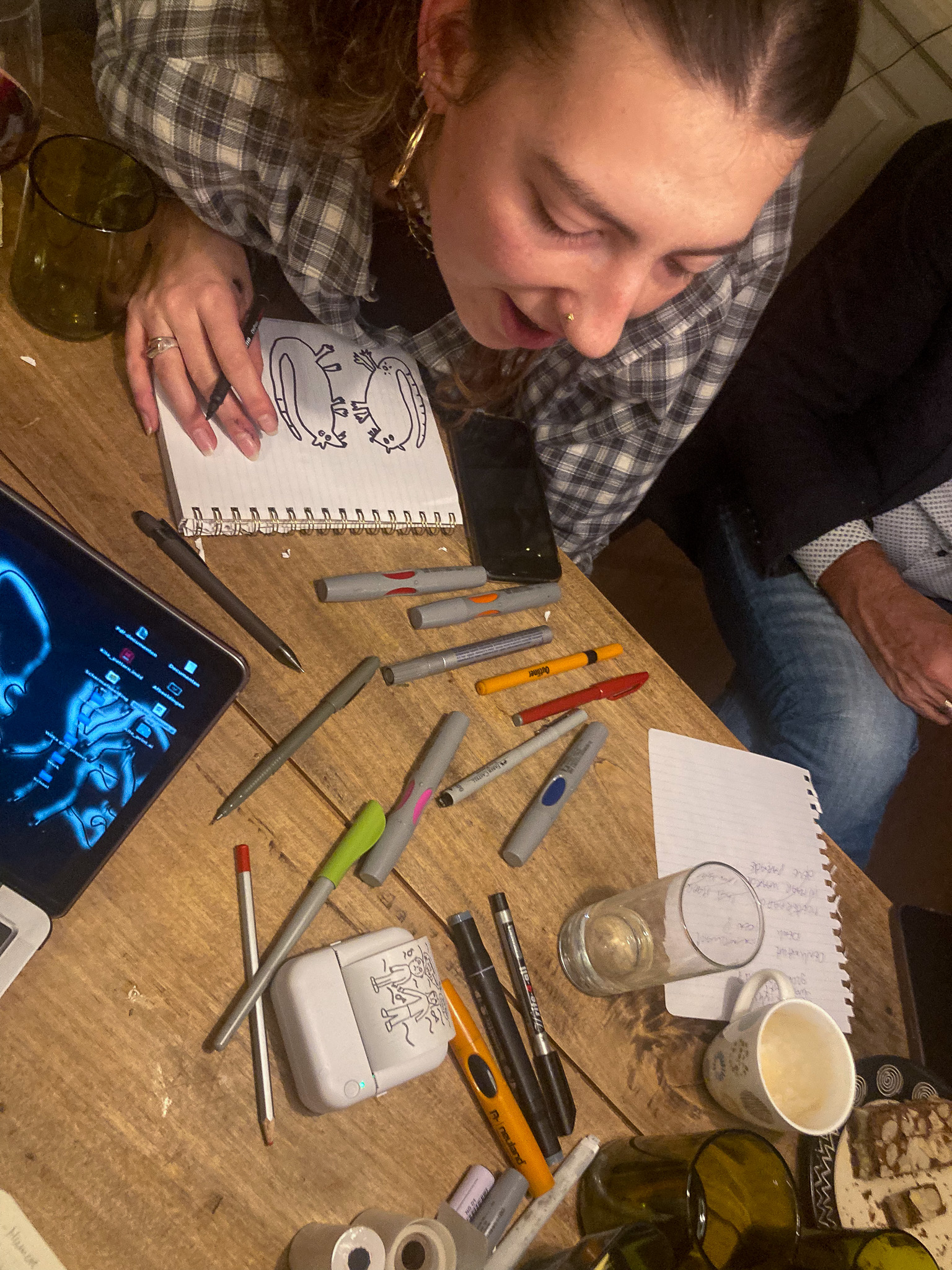
8.11.2023Preparation
Personal goal
Group goal/incentive
Audience
Setting
Presentation
Group goal/incentive
Audience
Setting
Presentation
first test of how a workshop of my project/topic could work.
preparing signs for the climate march sunday 12.11.2023. Thinking about how you could play with the visuals / typo-graphics in order to convey your slogan.
7 relatives from a friend of mine, froom ages 13-60.
at their diner table after dinner (20:00-22:30)
![]()
![]()
![]()
![]()
![]()
![]()
![]()
![]()
![]()
![]()
![]()
![]()
![]()
![]()
![]()
![]()
![]()
![]()
![]()
![]()
![]()
![]()
![]()
![]()
![]()
![]()
![]()
![]()
![]()
![]()
preparing signs for the climate march sunday 12.11.2023. Thinking about how you could play with the visuals / typo-graphics in order to convey your slogan.
7 relatives from a friend of mine, froom ages 13-60.
at their diner table after dinner (20:00-22:30)


Workshop evening


- Some participants were really set on their textual message, and found it hard to consider the design at the same time. They seemed to struggle with how the content of the message could translate to a design.
- Some participants spend the workshop creating many different slogans and ideas on how to execute them visually, but did not create a finished design during the workshop.
- Other participants thought of themselves as ‘not creative enough’ and said they needed ‘more time to think and gather inspiration’, or wanted to copy the message of someone else to use during the protest (that of Loesje). They would rather not share anything during the feedback rounds. When talking to one of these individuals one-on-one however, they felt more comfortable to share their ideas, which turned out to be quite original and interesting.
- Another participant had a really hands-on approach, and started drawing and writing even before the presentation was done. She participated in the first feedback round, but after an hour she created two designs on different formats, and she felt like she was done and did not rethink/improve her design further.
- One participant really enjoyed designing/thinking within the margins I proposed during the presentation. This participants created things I had imagined as outcomes for this workshop, but with information/content I did not provide and she came up with herself.
- There were some questions about the goal of the workshop: “why is creating a different kind of protest sign neccesary; why would you not just use cardboard and paint?” “what is the added value of creating small stickers”? After a more in-depth explanation about on my part they seemed to get it. There are different ways to convey (activistic) messages. One is not better than the other, but through the design you are talking/attracting different (groups of) people. This seemed to click with the participants, and they re-set their goal into creating a design that would perhaps be photographed and circulate in the media (and not create a slogan that merely sounds/reads nicely.)
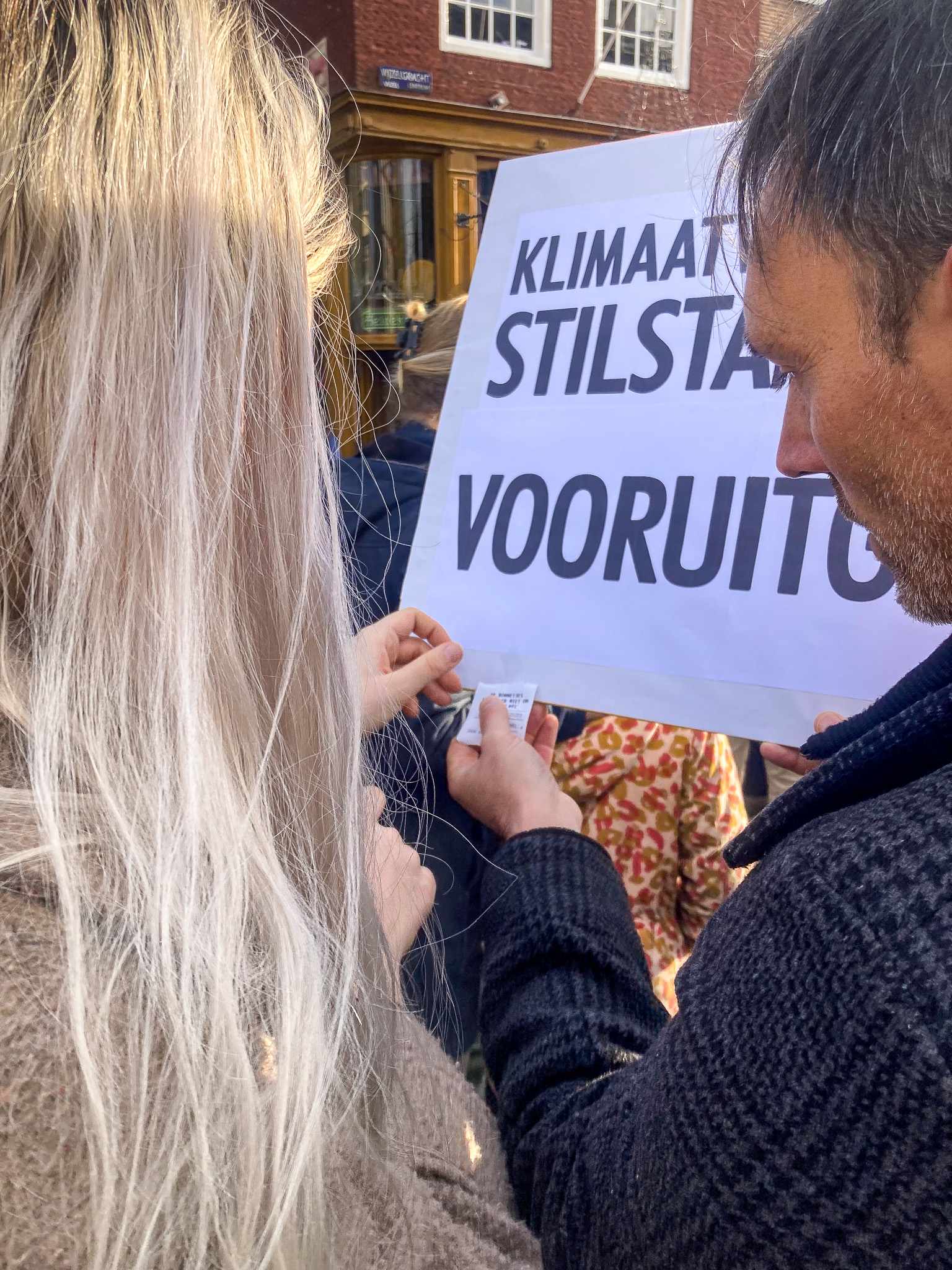
During the climate march


Feedback
“het was echt een goeie workshop, heb nu wel andere protestdingen in mn hoofd dan wat ik anders had gemaakt.”
“De presentatie was goed, misschien waren er duidelijkere stappen nodig daarna, dat het duidelijker was hoe we wat konden maken”
Notes of the workshop:
Notes on the march
“De presentatie was goed, misschien waren er duidelijkere stappen nodig daarna, dat het duidelijker was hoe we wat konden maken”
Notes of the workshop:
- Some people needed more guidance. It’s better to have strict margins and set a timer for feedback rounds. You can always be less strict when you see that some people prefer to do their own thing. If you start out ‘vague’ it is hard to define more rules later on, but if you give them clear rules you could always let a few go later on.
- The amount of examples and guidance needed depends on the audience. This audience was quite diverse; some had a background in a more creative/design field, some did not. Having an audience that have a more-or-less similair working/thinking method would be helpfull for the over-all flow of the workshop.
Notes on the march
- The younger boy started out with an attitude, and did not really want to participate in the climate march but rather play with his friends. I talked to him, and gave him more of the stickers he helped to create during the workshop. He was excited to paste the stickers. After a while, a police officer came to him and asked him not to put stickers on the street furniture. After this, he was even more invested in the march and spreading stickets, as it was a rebellious activity and he had a story to share with his friends about his contact with a police officer.
︎︎︎this did make me realize that I should have spend some time in the workshop for people to learn their rights (aanplakrechten) during a protest.
- The receipts got some attention because we pasted it on the backs of ourselves and some people (with their consent), and on some bigger protest signs. Some people thought it was pasted on us without our knowledge and wanted to let us know that. In general, people had to come closer in order to read the receipts. This often sparked a conversation about the information that was on the receipts. We also left some receipts on poles and traffic signs, and we don’t know the impact of that. It did feel a but like littering during a climate march though, so some extra thought needs to be put in the material and design of this.
- The traffic-sign ‘go left’ got a lot of attention, from professional photographers to people taking pictures with their phone, and posting it on their instagram. The creator was really excited about it: “I hope I can find my picture on some of these websites that post about protest signs!”.
During the workshop, she at first did not completely get the idea of playing with different visual languages. Together, we found out who she wanted to talk to and why, and how she could use a typo-graphic design that fitted this idea. She wanted to create a bigger, striking design that also had an humorous edge, and she hoped that it would catch attention in the protest crowd, so people would take pictures of it and it could circulate on media sites, and in this way spread the message also outside of the context of the march. She reflected that this definitly succeeded!
Next steps?
Create a toolkit?? For whom? When could you use it? Where? Why? How?Feedback after the workshop:


Preparation collective moment 3
29.11.2023
29.11.2023
Title
What
Why
How
Who
Writing the city, reading the streets
A publication about typographic landscaping,
that investigates how graphic design relates to place- and meaning-making,
through researching how (and why) established designers add to the city-scape. The written research is supported by a series of graphic interventions/visuals,
and the toolkit contains a series of exercises for the introverted activist to develop their visual voice and re-write the city streets.
These exercises can be done independently, or you can follow a workshop by me where you get help in further developing your designs.
| Assessment Criteria | |
| express in the work your own artistic vision of the problem or assignment and the discipline; | |
| My Graduation Project |
I see myself as (design) facilitator, or socially engaged designer, and want to design with people, rather than for.
The problem is the lack of research on how graphic design intersects with place-making and meaning-making. With this project that has the topic of typographic landscaping, I intent to show the (social) importance of (public) visual communication.
| independently arrive at innovative answers: through experimentation, an inquisitive attitude, and the formulation of new perspectives on the subject; |
Started with personal graphic experiments and interventions in the city streets ︎︎︎ did this experiments with others in a workshop ︎︎︎ developing a toolkit to share my found knowledge (?)
incorporate conclusions from the research into the realization of the final project;
Research: there are different frameworks from which designers add to the typographic landscape of the city. More inquiry is needed on typographic landscaping (the intersection of typographic design, urbanism and ideology), and how peoples’ cultural values and current issues are presented in the city they inhabit.
The realization of the final project encourages people to think about and add to the typographic landscape, using their visual voice in combination with the visual language of the institutions in power.
The realization of the final project encourages people to think about and add to the typographic landscape, using their visual voice in combination with the visual language of the institutions in power.
also use the knowledge and expertise of others during implementation;
Interviewed designers: Pauline Wiersema, Pieter Vos from 75B, a graffiti artist, Arno from design agency In10.
Also a meeting with Mike from the Independent School for the City, and I followed a workshop at the same place from Team Thursday.
Other external partners are the people that participated in my test workshops
Also a meeting with Mike from the Independent School for the City, and I followed a workshop at the same place from Team Thursday.
Other external partners are the people that participated in my test workshops
demonstrate an entrepreneurial attitude by actively involving work in practice and current market developments; take into account the interests and views of various stakeholders;
Social and academic relevance of the thesis is explained in the research.
The workshop for the introverted activist is relevant for various stakeholders, ranging from individuals to activist groups.
The workshop for the introverted activist is relevant for various stakeholders, ranging from individuals to activist groups.
*that will be defined/discussed later:
| Other assessment Criteria* |
arrange a presentation of your work, in which all relevant components are clearly visible for the examiners and external advisor. |
the presentation of the final project convincingly shows research, process, end product and future positioning in the professional field.
demonstrate that the presentation of the work is designed in a well-considered manner in the context of the final exam, under the prevailing circumstances.
demonstrate that the presentation of the work is designed in a well-considered manner in the context of the final exam, under the prevailing circumstances.


Developing the Writing the city // Reading the streets toolkit
Theory
Publication of my EUR thesis: Designing meaning with vernacular typo-graphics in the city of Rotterdam.
- What is important for people to know; what do I keep and what do I keep from my thesis?
- Do I need to add things? About activism? Aanplakrechten?
Visuals
The research is supported with graphic designs, ranging from example pictures to more speculative visual essays.
- Visual essays
- Images that illustrate/enhance the understanding of the theory
Practice
Exercises for the introverted activist, to design their message using vernacular typo-graphics of the institutions in power, to re-claim and re-write the city streets.
- For the ‘introvert activist’
- Playing with formal/informal visual languages to convey your message
- Different levels of exercises? For various topics, or different levels of engagement?
Research file
= A summary of my EUR thesis, with added theory and information relevant to my WdKa project
= A summary of my EUR thesis, with added theory and information relevant to my WdKa project
Graphic design ideas for the publication
- Vernacular (recognizable, familiar, underground, local, ...)
- Playing with formal - informal visual languages
- Field notes
- Personal journey; handwriting
- Layers; different kinds of layers (different paper sizes; thickness; textures; fontsizes, etc.)
- Cut-outs
- Zoektocht; schatkaart; treasure map
- Archive (of the streets)
- Documents
- Scratching and doodling (as in re-writing)
- Concrete, brick, pavements
- Pocket size exercise book; to take out on the streets?
- Publication has to fit through the mail box?
- A binder/box in which all of the theory, findings and graphic outcomes come together
- How are the results shared, if they even are being shared?
Toolkit prototype:

Feedback Maaike 27.11 & 5.12
Soort flow-chart; wat voor soort activist ben jij? > verschillende levels van exercsies, voor verschillende profielen
Wat is nuttig voor de content van mn publicatie?
Itteratief; de workshop wordt meer ontwikkeld
Context mapping exercises
workshop zichtbaar in de toolkit; wat is de toegevoegde waarde van een workshop? als je moeite hebt met wat precies
De link tussen theory en praktijk uitleggen met diagram oid?
zoveel mogelijk links uitleggen op een korte manier; zo min mogelijk overlaten aan de interpretatie van de assesoren.
What information is neccesary for the toolkit?
How much theory?
Verschillende lengtes in opdrachten; geef aan hoelang mensen bezigzijn ermee. Titel, doel, wat heb je nodig. complexe exercises koppelen aan de theory, aan t eind van de hoofdstuk kleine vraag om over na te denken. Notitieboekje erbij? wat voegt dat notitieboekje dan toe? Eindig elk hoofdstuk met ‘questions to ponder’ over elk hoofdstuk. Concreet iets doen / actionable vs. reflectiemoment, waar geen antwoord op kan komen.
Stuur draft van boekje en draft van exercise kaarten.
Developing the exercises
Inspiration from Taking a Line for a Walk; Assignments in design education


Chapter of publication
Key points
Exercise
Introduction: Visual inflation
Introducing the topic and research question, and touching upon it’s relevance
Visual: of the speculative question
Starting Reflection Question
Goal: thinking about the knowledge you already posess.Duration: a few minutes
You need: pen and paper to write down the answer.
How often do you read texts when travelling through the city?
Did the way in which these texts are designed ever catch your attention? If so, why and how?
Chapter 1: Who is writing the city?
Further explaining the relevance by explaining where design theory now stands. Who is a designer, and what is their power? Why does it make sense to turn to the production side of meaning-making?
Visuals from the city-grids workshop, and from my archive
Peeling away the layers
Goal: Who is writing? Who is an amateur, who a professional, and how do you know? What are your ‘aanplakrechten’? Walking as an artistic research practice (Derive inspired). Duration:
- Stage 1: Collecting pictures: about 30 minutes
- Stage 2: Reflecting on the pictures: 30-60 minutes
- Stage 3: Additional research: 60 minutes
- Stage 4: Designing: 60-90 minutes
You need:
- Your phone camera
- enough storage in your phone to archive the pictures
- Optional: a printer if you want to print out the pictures and compare them next to eachother.
Collecting
Take pictures of 10 traffic light poles, street signs, walls, or anything else you encounter when walking on the city streets that has graphics pasted on it. You are encouraged to also notice the stickers or posters that have faded or ripped.
Reflecting
Make a folder with all the stickers pictures, and identify patterns:
- Did you find the same sticker in different places?
- what are the most common messages or intentions (commercial, artistic, activistic, political, etc.)?
- which stickers (do you think) were made by professional designers? And which ones by amateurs?
Research
Choose your favorite sticker and do some detective work! Try to find out more about the sticker: What was it meant for? who made and pasted it? And how long ago?
Are these stickers, or glue residues that are left, pasted illegally on the poles? Where can you put up stickers or posters around the city, and where do you get fined for it (and how much)?
Designing
For designers:
Pick one sticker you really do not like. Redesign it. Reflect on your design choices.
For non-designers
Pick one sticker you really like. Recreate it, but change the content of the message to fit you personally.
Chapter 2: The ‘street’ in reading the streets
On urbanism, place-making, and explaining the context of Rotterdam in this case.
Greetings from the city
Goal: the city as a place to inquire in. For who is the city? Duration:
- Stage 1: Collecting pictures:
- Stage 2: Reflecting & research: 30-60 minutes
- Stage 3: Designing: 60-90 minutes
You need:
- Your phone camera
- enough storage in your phone to archive the pictures
Stage 1: Collecting
Walk around your city, or if you do not live in a bigger city, plan a fieldtrip to a city closeby. Walk around and investigate what the city branding of that place could be. Take pictures of the visual languages that possibly tell you this.
Stage 2: reflecting & research
Look up what the city-branding of that place actually is.
- How does it compare to your findings?
- Did you already know this?
- Do you feel like the city-branding is relateble for the people in the city?
- Who does the branding speak to, you think? Does it work?
Stage 3: Designing
Create a postcard from the city which branding you analyzed. Either
-
keep the slogan, but change the letters completely with letters you found in the city,
- or change the slogan, but use a similair visual language as that of the city.
Chapter 3: Vernacular voices
What is meant by vernacular typographics?
Visuals from the workshop I gave, and from rotterdam centrum to rotterdam south
Mapping vernacular voices
Goal: further researching who is saying in the typographic landscaping; but now also how they are saying it / perceived! VERANDER !
van [deze wijk] naar [deze wijk]
Duration:
- Stage 1: Collecting pictures:
- Stage 2: Reflecting on the pictures: 30-60 minutes
- Stage 3: Additional research: 60 minutes
- Stage 4: Designing: 60-90 minutes
You need:
- Your phone camera
- enough storage in your phone to archive the pictures
Stage 1: CollectingPick a specific genre of buildings that exist in multiple areas around the city. For example; places to get coffee; places to get fastfood; places to buy lamps, etc. (Do not pick franchise with their own branding.)
Travel to 3 (or more) different neighbourhoods with in the city and take pictures of graohic expressions used in the similar genre building in these different places.
Pick two neighbourhoods in the city that differ the most in socio-economic backgrounds.
Visit the shopping centre / street with all the shops of both neighbourhoods. Take pictures of the different shopfronts.
Stage 2: Reflecting
Create one big folder with all your pictures.
Try to identify patterns and categories, and create smaller, sub-folders out of your main archive. You can do this based on the following questions:
- What kinds of shops does each neighbourhood have: what are the differences or similarities?
- Is there a difference in the graphic expressions of the shops you captured? How?
- Do you notice any graphic trends or stereotypes present in the neighbourhoods? (Think of colour, typography, handwriting, printed matter, photographs, etc.)
Stage 3: designing Make a series out of this, add more pictues of the same genre, or visit the different neighbourhoods again and compare more graphic expressions between the different buildings.
Make a conceptual map of both neighbourhoods, using the letters from the storefront pictures in your archive to write names for topographic depictions.
[example: from north to south]
Chapter 4: What are we reading in the streets?
How ideology intersects with typographic landscaping. On the crossroad of typography, topology, and ideology
Traveling between typography, topology, and ideology
Goal: Duration:
- Stage 1: Collecting pictures: however long your travel time is
- Stage 2: Reflecting on the pictures: 30-60 minutes
- Stage 3: Additional research/archiving: 1-3 hours
You need:
- Your phone camera
- enough storage in your phone to archive the pictures
Stage 1
Make two photoseries about the texts you encountered the next time you have to take public transport somewhere. One is about the text messages that tell you information you need to know for your travels, and the other one is information that is not relevant for your journey.
Stage 2
Take a look at the text images you’ve captured.
What do you notice?
Who is speaking to you?
And how do they do this?
What do you think this means for the public space? For whom is the public space?
Stage 3 Do this for two weeks. Make an archive of your findings. Make sure to map the locations of your findings in the archive.
Write out two receipts for your travels. One with the OV costs, and one with the advertisements costs.
Frameworks
The different frameworks through which people add typographics to the city-scape.
Ending Reflection Question
Duration: a few minutes
You need: pen and paper to write down the answer.
Play with the visual language and written language (aka the actual content) of the various framings.
Conclusion
Do you think you will now notice the texts in the city more / in a different manner?
Testing first drafts of the exercises
Feedback:
Opdracht: Take pictures of 10 traffic light poles, street signs, walls, or anything else you encounter when walking on the city streets that has graphics pasted on it. You are encouraged to also notice the stickers or posters that have faded or ripped.
-> alles kan graphic zijn, dus misschien verduidelijken als in stickers, of posters. of is juist het doel om alles te fotograferen?
Het kan een beetje overweldigend voelen omdat er zoveel grafisch is.
Maar samen met de anderen werden we wel bewust van al het grafische daardoor, alleen kon je door de bomen soms het bos niet meer zien…
Friso: Omschrijving is een beetje vaag, alles kan grafisch zijn? (= wel een kritisch ingestelde filosofie persoon.)
We, jabe, Simone en Friso, hebben de eerste twee onderdelen van opdracht 1 gedaan.
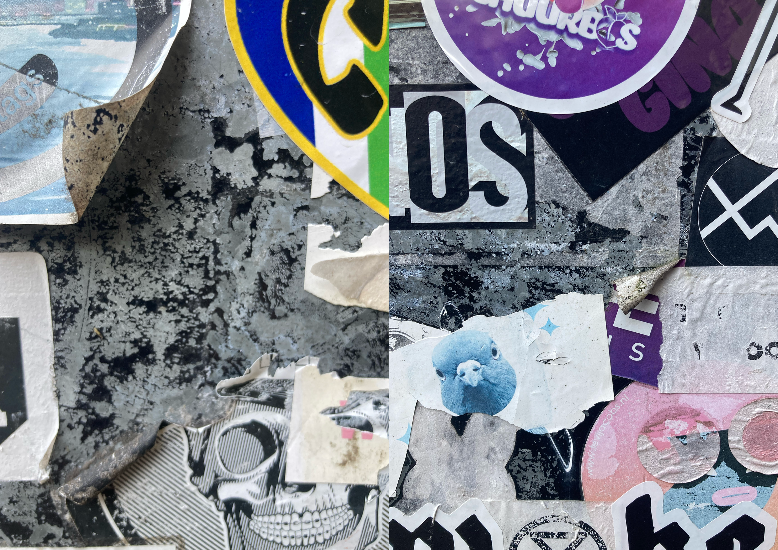
Friso en Simone waren een beetje nieuw tot je project, en misschien mede door mijn uitleg een beetje verward/vonden de uitleg een beetje vaag. Hadden de vraag dat alles grafisch kon zijn, en het dan overweldigend kon zijn om in de stad zo rond te lopen.
Maar toen we eenmaal begonnen, kwam wel de hele stad tot leven, als in dat elk straat bord/paal stickers hadden maar ook de grafisch design van die objecten ook meetelden. Zoals een zebra pad of stoplicht is zonder de stickers ook al grafisch design(?), misschien is het een interessant verschil van legitieme/officiële designs tegen de “illegale” stickers/graffiti! En natuurlijk de overload aan reclames die ons ook opviel.
Maar we raakten al snel op het onderwerp de stickers omdat die overal zitten en opvielen en op die manier interessanter zijn. En daardoor hebben we ook gepraat over politiek en de stickers en de campagnes en meer.
Het viel ons ook op dat je de zelfde sticker op een route meerdere keren ziet, alsof het een soort speurtocht is, zo kwamen we ook bij het onderwerp de bordjes voor de wandelingen die door Nederland en de rest van de wereld verspreid zijn.
Zo hadden we 3 categorieën gemaakt, commercieel, politiek en artistiek.
Hier konden we (bijna) alle stickers bij indelen.
De officiële ‘stickers’ als in verkeersborden waren natuurlijk ontwerpen door professionals maar alle stickers hadden een soort artistieke vibe en niet per se professioneel, misschien ook omdat ze al ‘illegaal’ zijn en ook verweerd door het weer buiten. En juist express ‘slechte/amateuristische’ stickers hadden ook een professionele look omdat dat dan artistiek kon zijn.
-> alles kan graphic zijn, dus misschien verduidelijken als in stickers, of posters. of is juist het doel om alles te fotograferen?
Het kan een beetje overweldigend voelen omdat er zoveel grafisch is.
Maar samen met de anderen werden we wel bewust van al het grafische daardoor, alleen kon je door de bomen soms het bos niet meer zien…
Friso: Omschrijving is een beetje vaag, alles kan grafisch zijn? (= wel een kritisch ingestelde filosofie persoon.)
We, jabe, Simone en Friso, hebben de eerste twee onderdelen van opdracht 1 gedaan.
Friso en Simone waren een beetje nieuw tot je project, en misschien mede door mijn uitleg een beetje verward/vonden de uitleg een beetje vaag. Hadden de vraag dat alles grafisch kon zijn, en het dan overweldigend kon zijn om in de stad zo rond te lopen.
Maar toen we eenmaal begonnen, kwam wel de hele stad tot leven, als in dat elk straat bord/paal stickers hadden maar ook de grafisch design van die objecten ook meetelden. Zoals een zebra pad of stoplicht is zonder de stickers ook al grafisch design(?), misschien is het een interessant verschil van legitieme/officiële designs tegen de “illegale” stickers/graffiti! En natuurlijk de overload aan reclames die ons ook opviel.
Maar we raakten al snel op het onderwerp de stickers omdat die overal zitten en opvielen en op die manier interessanter zijn. En daardoor hebben we ook gepraat over politiek en de stickers en de campagnes en meer.
Het viel ons ook op dat je de zelfde sticker op een route meerdere keren ziet, alsof het een soort speurtocht is, zo kwamen we ook bij het onderwerp de bordjes voor de wandelingen die door Nederland en de rest van de wereld verspreid zijn.
Zo hadden we 3 categorieën gemaakt, commercieel, politiek en artistiek.
Hier konden we (bijna) alle stickers bij indelen.
De officiële ‘stickers’ als in verkeersborden waren natuurlijk ontwerpen door professionals maar alle stickers hadden een soort artistieke vibe en niet per se professioneel, misschien ook omdat ze al ‘illegaal’ zijn en ook verweerd door het weer buiten. En juist express ‘slechte/amateuristische’ stickers hadden ook een professionele look omdat dat dan artistiek kon zijn.

Flowchart
Introduction: how to read/use the boxInspiration
Dérive, Guy Debord
![]()
![]()
![]()
Dérive, Guy Debord


First sketch

Second sketch
Visualisation
6.12.2023
What needs to stand out, what colour gradations could you use for that?
How is it al binded? Why should you bind it together, why not?
-> to put it next to each other; to change the order.
What materials need to be included in the toolkit?
What do I sent into the world with this toolkit?
What kind of input do I want?
Do I want to collect this, and if so, how?
- The introduction needs to be picked up first; so visually make it stand out, by using a different coloured paper, or perhaps put a big 1 on the front, or a sticker with ‘pick me first’ or something.
- The images in the publication should be coloured, as the color is part of the visual communication, and it should also excite people to make things themselve.
How is it al binded? Why should you bind it together, why not?
-> to put it next to each other; to change the order.
- The publication is one continious research, so it makes sense to keep that in the specific order.
-
The exercises can be done in various orders; the reader can pick and choose. So it make sense to make loose pocket-sized cards.
What materials need to be included in the toolkit?
- Notebook; because I ask questions and so people could write findings down. However the order of the exercises and thus findings are not fixed
- Camera? Pens? Stencils?
- Place for the map of the city
- Stencil to make a postcard
What do I sent into the world with this toolkit?
What kind of input do I want?
Do I want to collect this, and if so, how?

Toolkit prototype 2

Feedback Nanna
Publication design process
What is the goal of the publication?
What is the goal of the publication?
- Putting theory next to graphics
- Providing background information; ‘diepgang’ van t project.
- For people who like to read/ find it easy to understand texts/concepts
- Blending different topics to create new knowledge / broaden the knowledge on graphic design
- Use color to help navigate and summerize, and excite?
- First theoretical chapters: touch on different topics. Last chapters + exercises: how they come together. How to show this visually? Layers?
- Disecting the ‘visual inflation’. Show this visually with the publication; overwhelming amount of layers, colours, type.., but when you dive into the publication each chapter has its own visuals for that specific topic, and it becomes less overwhelming.
- Make it fun!
Design concept
When you start reading, the publication feels overwhelming as you see all the different colours and type layered on top of eachother. But when you dive into the text, each chapter gets bigger as you dissect the layers of the city while you get a better understanding of the theory. In this way the design of the publication helps you step by step in understanding the different layers and messages present in the city-scape, and you feel less and less overwhelmed.


Type tests
Seismic Latin VF
From regular for the body text, to ‘shock’ and ‘aftershock’ for the titles and subtitles
it is a sans-serif typeface in which the various weights have various levels of distorted letters.
This refers to how I am trying to shake up this promise of the sans-serif that is now present in the city. (more on this you can read in the research)


Paper/color tests
The neutral, gray/sand/black papers have different textures and weights. It visually refers to the textures and buildings of the city: from glossy glass to textured concrete.
The coloured papers refer to the typographic designs that are present in the city: they scream, try to stand out, make you notice them, whether it is a traffic sign or a graffiti tag.
It literally is a visualization of how design makes the city more colorful; more interesting (as various interviewees have also mentioned)


I liked the contrast of the bright, neon
colours on the gray papers, but felt like it lacked something, maybe some character/personality or some middle ground/negotiating colors/texture.
Taking inspiration from my archive of the typographic landscape, I did some tests with purple graffiti.
This added that extra character/color/texture I was looking for: it complements the grey and also the bright colours. Additionally, I really liked how the purple gives an almost dreamy, foggy haze.


Presentation points

Completed research
EUR thesis
Writing the City; designing meaning with vernacular typo-graphics in the city of Rotterdam
Outcomes:
Writing the City; designing meaning with vernacular typo-graphics in the city of Rotterdam
Outcomes:
- focus on the production side of meaning-making
- more research needed in order for the graphic design field to have conversations with the larger social world and other other disciplines, such as urbanism, sociology, politics
- different frameworks through which people add visual language to the city streets ︎︎︎ you can play with the intentions and graphic designs of these framings, and play with the expectations of the reader in order to gain attention in the visual inflated city-scape
Starting question for design project
How can I now turn this knowledge into action through design?
How can I investigate this topic, not as academic interviewer, but as a graphic designer?
What do I want to give/learn others with my project?
How can I investigate this topic, not as academic interviewer, but as a graphic designer?
What do I want to give/learn others with my project?
Goal/intention
What do I want the audience to do; what do I do with the results?
What do I want the audience to do; what do I do with the results?
Awareness, but also turning this awareness into action.
Re-writing the city streets and reclaiming the public space.
The methods learned can perhaps also be applied to other complicated and urgent topics:
1. Reflecting on your personal and preffered learning style;
2. Going for field research/ looking around you and at what is happening
3. Creating a personal archive
4. Reflecting on your archive: what do you see? Are there patters and categories?
5. How do these patterns/categories come to exist? You can disect this in different layers:
1. Who
2. Where
3. What
4. Why
6. Turn your knowledge into creation!
Questions for last collective meeting 11.01.2024
I have this plank that I am planning to put stickers and graffiti on, to make it feel like a ‘piece of the street’. (I didn’t bring it for this moment because it was too heavy..)
I sent out the toolbox to a few people to use, and I also want to display these used versions of my project, but I am not quite sure how exactly;
- putting pictures of the results & used toolkits on a screen above the plank?
- stalling out the used toolbox on an extra plank, besides or on the other side of this plank?
- printing out pictures and stickers etc. from the used toolbox and pasting them on the wall above this plank?
I am also doubting wheter to put my laptop with this process website on display during assessments. (I did already put screenshots in my process document, so I’m not sure what the added value would be)

Tests of the final version of the toolbox
Person
Selection of pictures they took around various cities
Feedback
Thijme
++ activist
-+ introvert
-- familiar with design
++ activist
-+ introvert
-- familiar with design


“Alles in de publieke ruimte ruimte wil iets van je. Dus ik wil eigenlijk iets geven wat jou iets geeft.”
“City-marketing in den Haag is vooral voor horeca, en ze willen meer de haagse identiteit neer zetten volgens mij, maar dat lukt niet echt in een ambtenaarsstad. Ik bedoel ADO zit nu in de keukenkampioen leage, er is niks om trots op te zijn. De city-marketing van scheveningen is ook zo anders dan Den Haag.”
“Ik ben ook echt anders gaan kijken naar de stad en ik ben de stad meer aan het ontdekken. Altijd als je rondloopt dan is dat omdat je eigenlijk iets moet: iets moet kopen, naartoe moet gaan, optijd moet zijn. Maar door dit te doen deed ik echt iets wat ik zelf belangrijk vind, en ik ben nu ook echt excited om stickers te plakken en de stad in te gaan. Ik maak de stad eigen door letterlijk mijn eigen teksten op te plakken.”
Thijme’s process & results


His results can also be found on the table.
Jabe
++ activist
+ introvert
++ familiar with design
++ activist
+ introvert
++ familiar with design


“Ik was er al bewust van, van tekst enzo in de stad, maar nu ik meer bezig ben geweest hiermee zie ik veel meer categorien. Zoals ook de commerciele en de politieke, en eerst keek ik vooral naar de grappige. En ook andere typografie buiten de stickers, zoals die van de gemeente enzo, die zijn zo anders en bijna neutraal maar eigenlijk dus helemaal niet neutraal omdat die teksten van de gemeente juist het meeste van alle teksten de structuur van de stad bepalen.”
“Omdat ik de stickers zelf heb gemaakt durf en wil ik ze ook echt plakken. Normaal bewaar ik stickers, maar nu wil ik mijn eigen boodschap verspreiden. Mijn stickers zijn vooral reacties op andere bestaande stickers in de stad, beetje ironisch vond ik wel grappig.”
“Omdat ik de stickers zelf heb gemaakt durf en wil ik ze ook echt plakken. Normaal bewaar ik stickers, maar nu wil ik mijn eigen boodschap verspreiden. Mijn stickers zijn vooral reacties op andere bestaande stickers in de stad, beetje ironisch vond ik wel grappig.”
Jabe’s process & results


His results can also be found on the table.
Milou
- activist
-+ introvert
+ familiar with design
- activist
-+ introvert
+ familiar with design


Her results can be found on the table.